Global Emotions during the Corona Pandemic
 Anna Machens
Introduction
This small project was created for a workshop in 2020. It showcases how BDSi can help with data science projects. Let’s dive into 3 steps of any data science project: Data acquisition, Modeling, Visualization.
Data aquisition
BDSi can obtain data from various sources for BMS researchers. These included in the past, but are not limited to text data, like newspaper articles, social media posts (Twitter, Youtube, Reddit,..), forum posts (for example from an idea submission board), etc.. Much of the data scraping we do ourselves, but if possible we also use open data. Here we made use of publicly available data that consist of over 500mio tweets from all over the world related to COVID19. These tweets all have location information, from country or state over city all the way down to precise geo-location tagging. The tweets were selected using keywords in different languages related to the corona epidemic. They originated in over 200 countries and were written in over 60 languages (1). We only downloaded 2 months of the data from Twitter, using the IDs provided in the dataset (see Fig. 2). For this showcase project we narrowed the data down to tweets with exact geo-location information. The data set contains rich information about how online communication differs across countries and time during the epidemic, for example how different countries deal with the corona epidemic, how the population reacts to measures, how the awareness of the epidemic develops over time, what topics are relevant at each stage of the epidemic or how emotions differ between countries or over time. For this showcase project, we had a look at the emotions.
| Time | Number of tweets | Number of countries | Number of Languages |
|---|---|---|---|
| March 2020 | 13942 | 152 | 41 |
| April 2020 | 45540 | 189 | 55 |
Fig 2. Subsample of GeoCovid19 data set for March and April 2020, which contains only Tweets with location coordinates.
Training data
In order to create a machine learning model for text classification, we need training data. This is often the most costly step. Luckily, there is a vast amount of training data already created by other research groups. We found a large training data set with over 20000 tweets in English, Spanish and Arabic classified according to their emotion (2). With the help of this data set we trained state of the art text classification models to classify the tweets of the GeoCovid data according to the emotions Anger, Fear, Sadness and Joy.
Modeling
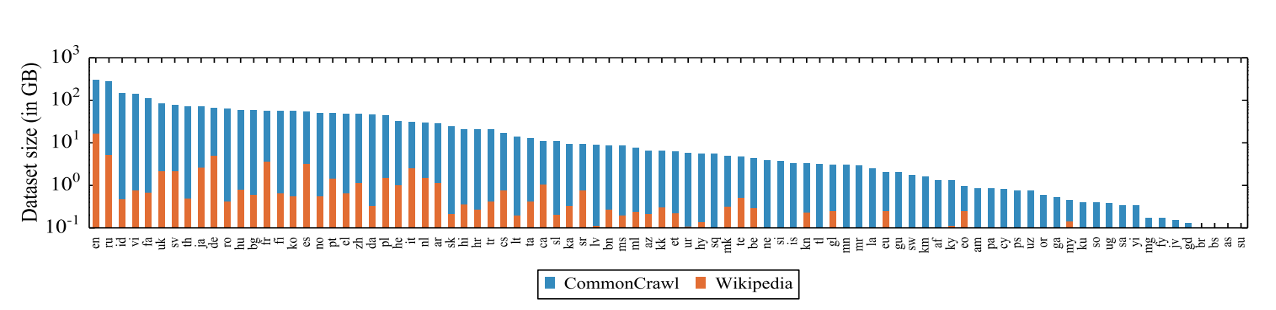
BDSi covers a large base of expertise with its scientists. We can help to find the model that’s best for your particular problem. For text classification we used a model from the family of transformers - deep learning models that can be used to deal with text: for translation, text generation, text identification and text classification among others. These are state-of-the-art models that beat classical approaches for text classification by up to 10% (3). Transformer models have a good text understanding learned from filling in missing words in sentences (Masked Language Modeling). They learn enough information about text from pretraining on billions of lines of text, so that text preprocessing like stemming or stop word removal is not necessary anymore. For this project, the transformer model we chose is XLMRoberta, a cross(X)-lingual Language Model that is particularly good at classifying text of multiple languages. In addition, models from the Roberta family (Robustly Optimized Bert pretraining Approach) are better than the Bert models, as they were trained with a more robust algorithm and much more data. XLMRoberta is trained on 2.5Tb of data from the CommonCrawl corpus and Wikipedia in 100 different languages (see Fig. 3). This cross-lingual language model significantly outperforms multilingual Bert, and shows better prediction capabilities for tasks in languages other than English compared to using a Roberta model trained on English text only and translating the input (4). Another advantage is that also multilingual training data can be used. Pretrained models are freely available at Huggingface (5) (6).
The pretrained model can then be used for finetuning to a specific task, which can be different from the one it was pretrained on (7).
In our case, we finetuned the model to predict emotions from tweets. For this purpose we could use the training data of the SemEval18 competition (2).
Fine tuning large language models on small data sets can be famously unstable.
It requires a large amount of tricks up your sleeve (8).
We first trained the model on the entire set of tweets in an unsupervised manner for fine tuning. Then we split our training data into 2 parts: one part for training using cross-validation. We used this data to optimize the hyper parameters and adapt the model weights for the task of emotion prediction. And one part for evaluating the model at the end.
As the model is multilingual, it was sufficient to fine tune it on a training set with only 3 languages (English, Arab and Spanish). As the text is first transformed into a language independent space, the model learns to predict emotions in all the other languages it was built with as well, from Arabic all the way to Vietnamese (4).
Model training is quite intense and needs GPUs with large memory. BDSi now has access to the HPC cluster (9) and does not need to rely on public GPUs. Once the model was trained successfully and applied to all the tweets in our dataset, we visualized the result in an interactive fashion.
Visualization
At BDSi we are often asked to help with visualizations of the data. Be it for data exploration or to present the final results. Once visualized, it is much easier to discover patterns in the data. Many of the visualizations we do are fully interactive. With the power of Shiny (10) hidden patterns and their connection to parameters can be brought to light. Here’s a link to our shiny apps (11). We used Plotly (12) for the visualizations related to this project. Plotly is a library that allows for semi-interactive plots that can be easily embedded in web-pages.
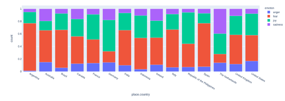
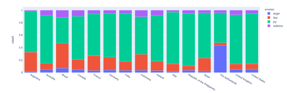
While the number of tweets related to Covid19 quadrupled from March to April, the most interesting change was seen in the emotions. In Fig. 4 and 5 we can see how the emotions change from March to April in various countries. While March was somewhat dominated by fear in many countries, tweets in April were mostly joyful. Looking closer at the tweets and their content, we could see, that the increase of tweets about covid was related to that. The hashtag and mention of corona now also appeared in tweets that were only loosely connected to the disease. The epidemic had become part of the life of people in good as much as in bad situations. In order to better understand the change of emotions, it would be necessary for a next step to understand the topics the emotions are related to. In Fig.1 we show an interactive plot of the sample of tweets from March.
Enjoy exploring data
If you are interested in any part of the process or need further information on data scraping, model training or visualization, please contact us at bdsi@utwente.nl
The project was done for a presentation of BDSi. You can find the Prezi-presentation of the project here
Refences
(1) Umair Qazi, Muhammad Imran, Ferda Olfi, “GeoCoV19: A Dataset of Hundreds of Millions of Multilingual COVID-19 Tweets with Location Information”, 2020, arxiv.org/abs/2005.11177
(2) Saif Mohammad, Felipe Bravo-Marquez, Mohammad Salameh, Svetlana Kiritchenko, “SemEval-2018 Task1: Affect in Tweets”, 2018, https://www.researchgate.net/publication/324834218_SemEval-2018_Task_1_Affect_in_Tweets
(3) Peter Usherwood, Steven Smit “Low-Shot Classification: A Comparison of Classical and Deep Transfer Machine Learning Approaches”, 2019, arxiv.org/abs/1907.07543
(4) Conneau et al, “Unsupervised Cross-lingual Representation Learning at Scale”, 2020, arxiv.org/abs/1911.02116
(5) www.huggingface.com
(6) Thomas Wolf et al., “HuggingFace’s Transformers: State-of-the-art Natural Language Processing”, 2020, arxiv.org/abs/1910.03771
(7) Jeremy Howard, Sebastian Ruder, “Universal Language Model Fine-tuning for Text Classification”, 2018, arxiv.org/abs/1801.06146
(8) Tianyi Zhang et al, “Revisiting Few-sample BERT Fine-tuning”, 2020, arxiv.org/abs/2006.05987
(9) hpc.wiki.utwente.nl/eemcs-hpc
(10) shiny.rstudio.com
(11) plotly.com/python